
The 1930s and Football’s Ugliest Uniforms

Numerous articles opine about college football's best uniforms, and you can agree or disagree with those lists, but this article is different. It describes and illustrates how college football teams in the 1930s collectively wore the ugliest uniforms in the game's glorious history. The evidence of ugliness is clear, and as Kevin Bacon once said, "These are the facts of the case, and they are undisputed."
On what basis do I make this claim? I have no special training in the arts or design, but I spend my spare time researching and writing about football history, and I illustrate my thoughts with relevant images. To find images showing the nature of play, stadiums and fields, fan behavior, and the equipment worn by players over the years, I spent portions of the last year reviewing the football sections of 3,000+ college yearbooks published between 1900 and 1960. While there are many yearbooks left to review, the process revealed that college football as a whole wore its ugliest uniforms during the Thirties.
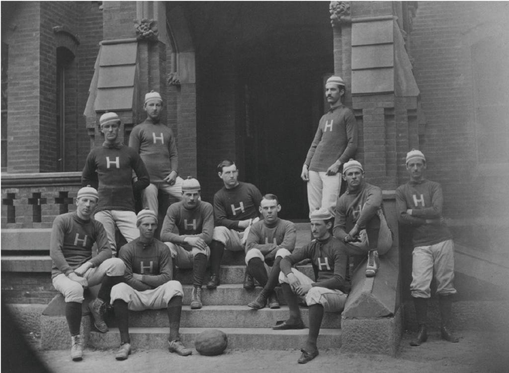
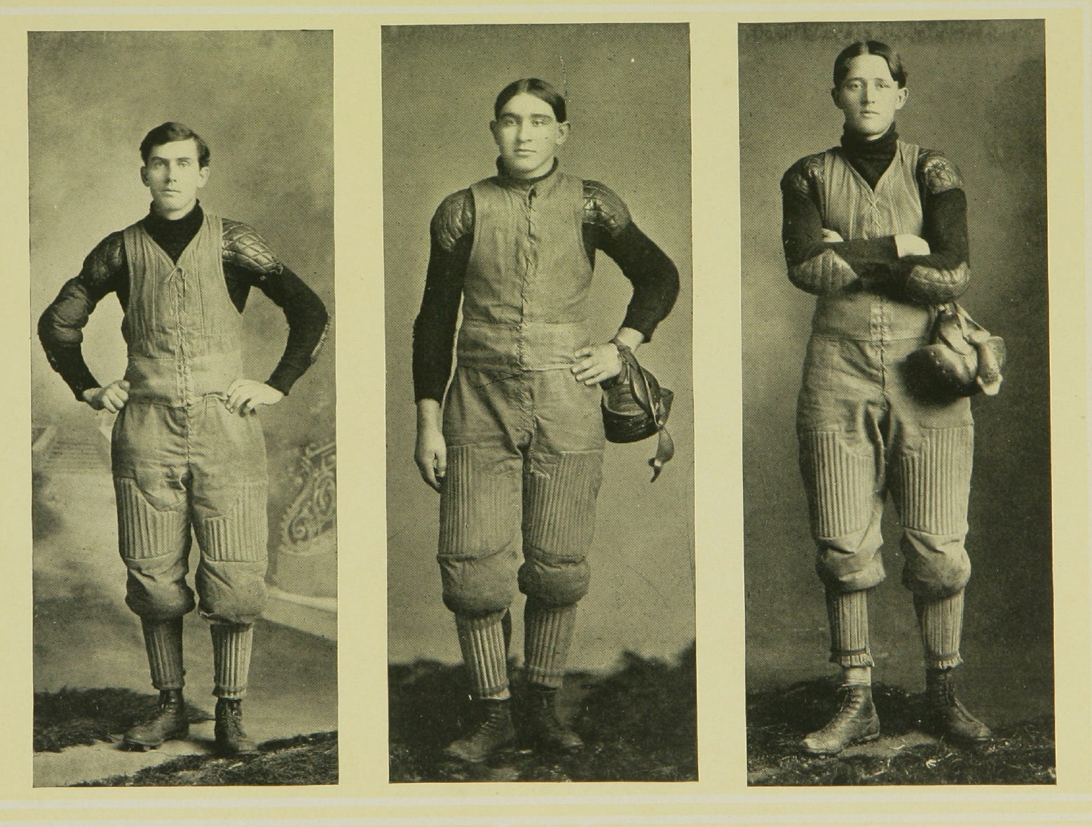
Before discussing the 1930s, let's review the uniforms of earlier decades. Football's first uniforms were light jerseys and stocking caps. Those uniforms quickly tore, so players shifted to heavier wool sweaters and pants made of moleskin or canvas dyed in earth tones. Many wore canvas vests over their sweaters or canvas union suits.

Many jerseys of the 1920s had friction strips sewn on the arms and front of jerseys to help runners grip the ball. Many of those were quite attractive, though some folks went overboard.

The Twenties also saw the transition to pants made of silk airplane cloth rather than moleskin and canvas - woven cotton fabrics that became waterlogged from sweat and rain. The use of knitted fabrics allowed manufacturers to design more form-fitting jerseys and pants, but after the outlawing of friction strips for artificially enhancing performance, designers want crazy creating barbarous combinations of stripes, proving that just because you can do something does not mean you should.
Besides the changes to jerseys, pants, and socks, a 1930 rule required teams to paint the exterior straps on their leather helmet in colors contrasting with the naturally tan helmets. (Some runners threw their tan leather helmets to the ground to trick defenders into thinking they had fumbled the ball.) During the same period, helmet manufacturers improved safety by supplementing the pads on the front of helmets. They stylized the pads; many became wing-shaped. Unfortunately, that led teams to paint the straps and wings, creating helmets that were ugly then and uglier now. There is a reason few retain that supposed "tradition." Still, I'm not here to make fun of Princeton or Delaware, only to show ugly uniforms and ugly helmets added to the spectacle.
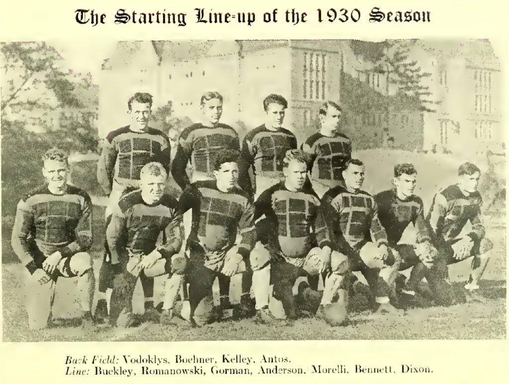
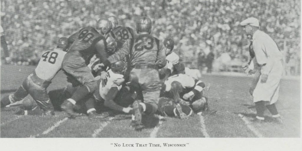
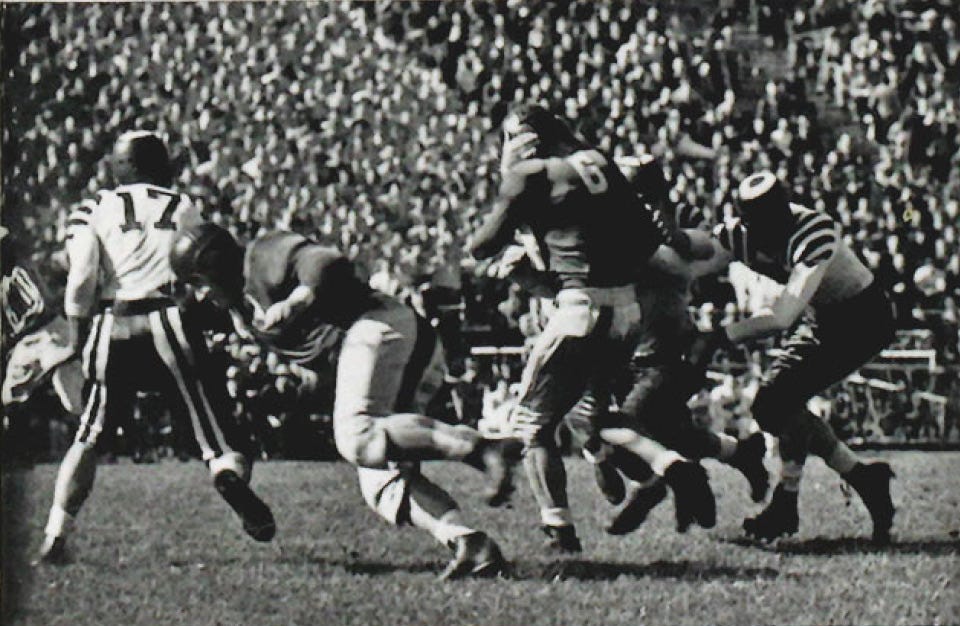
Enough words. Let's look at more pictures.

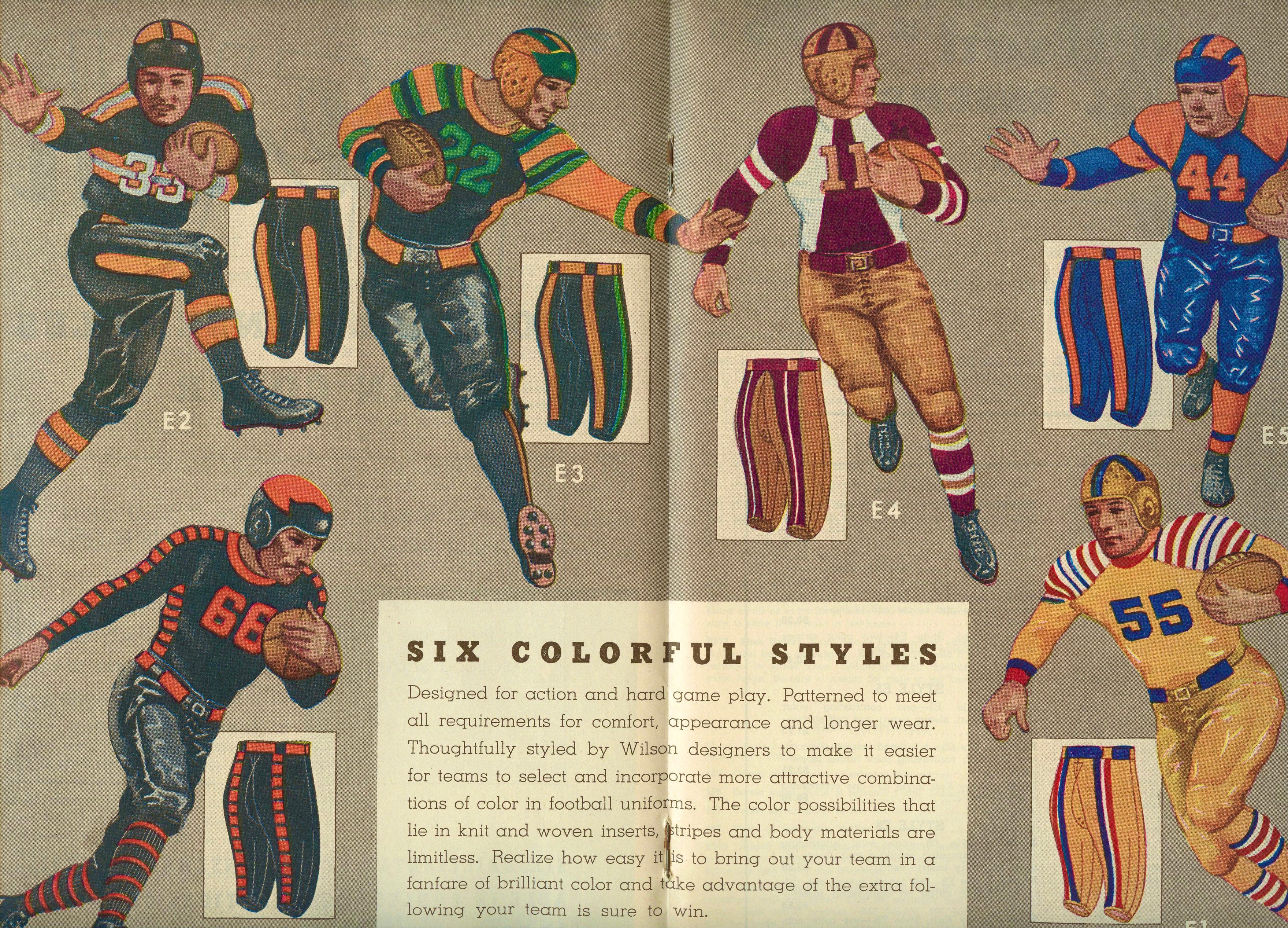
If the images above have not convinced you the 1930s uniforms were abominations, perhaps the black-and-white images mask their ugliness. We solve that issue by presenting two pages from Wilson's 1938-39 Fall and Winter Catalog. It is unclear whether any school purchased one of the pictured combinations, but one hopes there were mass firings at Wilson following the catalog's release.
So, what have we learned? First, no matter how ugly a team's uniforms might be today, the 1930s had less attractive uniforms.
Second, while schools like Minnesota and Purdue share the misfortune of their forebears choosing horrible school colors, they appeared in only one of the images shown. Even schools blessed with decent colors made awful mistakes that decade. Regardless of a school's colors, all can achieve uniform respectability simply by avoiding design cues from the 1930s.
Third, America was in the depths of the Depression in the 1930s, and football uniforms of the era made things worse. We should never return to those dark days, even for the silly throwback uniforms teams trot out periodically. Ugly uniforms then are ugly uniforms now. These are the facts of the case, and they are undisputed.
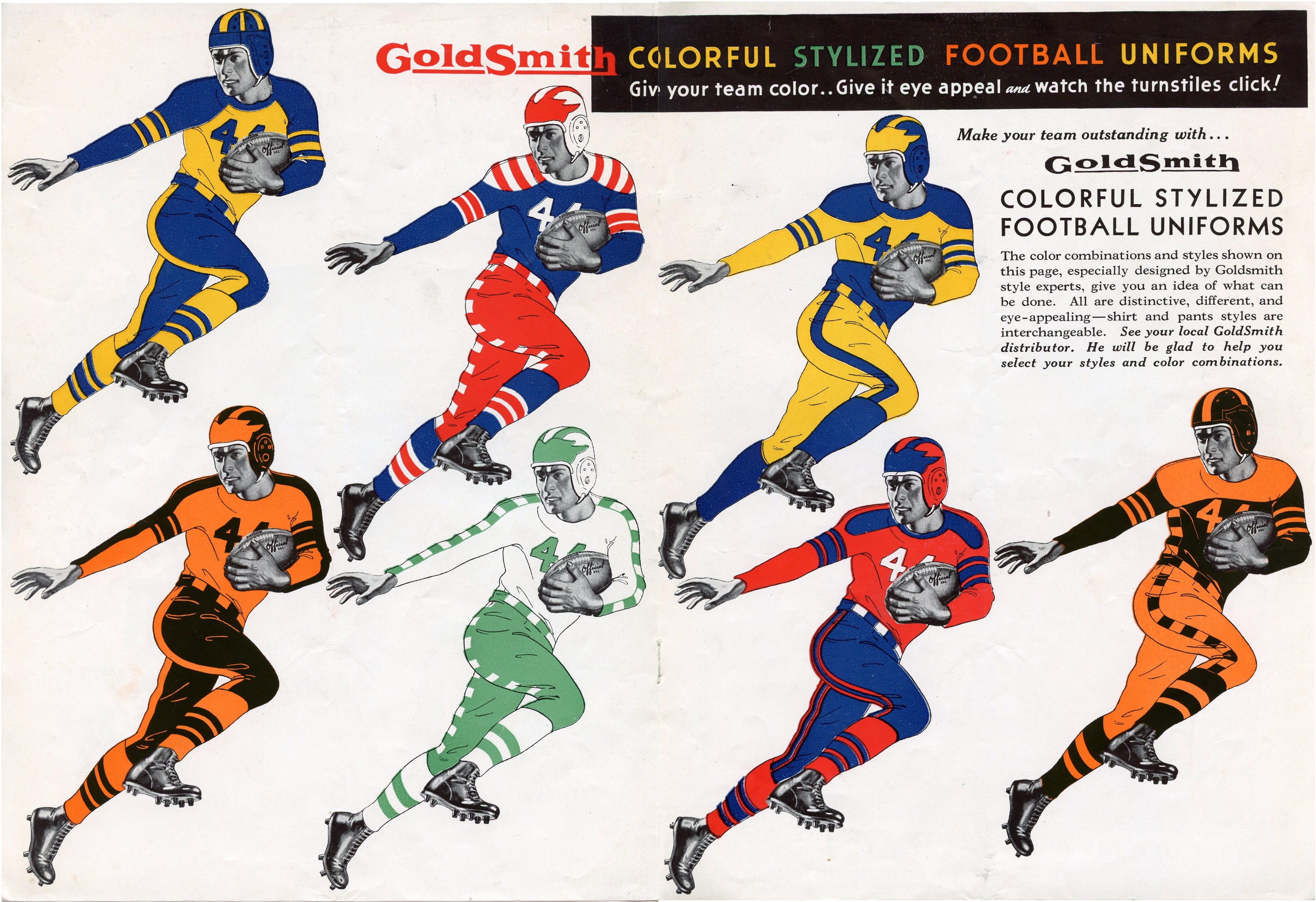
Postscript
Six months after publishing this post, I acquired a brochure touting the GoldSmith uniform brand, demonstrating that Wilson was not alone in designing ugly uniforms in the 1930s.

Football Archaeology is reader-supported. Click here to buy one of my books or otherwise support the site.
You can tell from my profile that i love winged helmets. Some of those uniforms are too much but it's kinda awesome how...OREGON they looked, considering how plain everything got by the 1950s