The 1964 MacGregor Fall & Winter Catalog - Jerseys
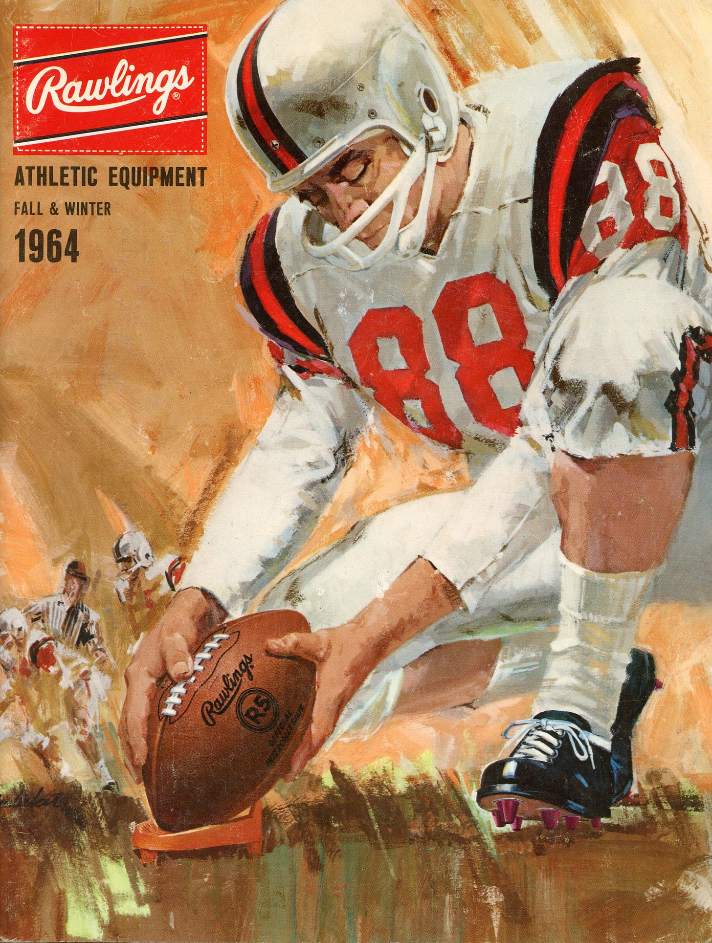
Some have accused me of paying insufficient attention to modern football. That, of course, is a lie, and to prove my awareness and interest in the modern game, we'll spend a few posts perusing the pages of the 1964 Rawlings catalog. Clearly, nothing shouts modern louder than my appreciation of this beautiful publication and its LeRoy Niemanesque cover.
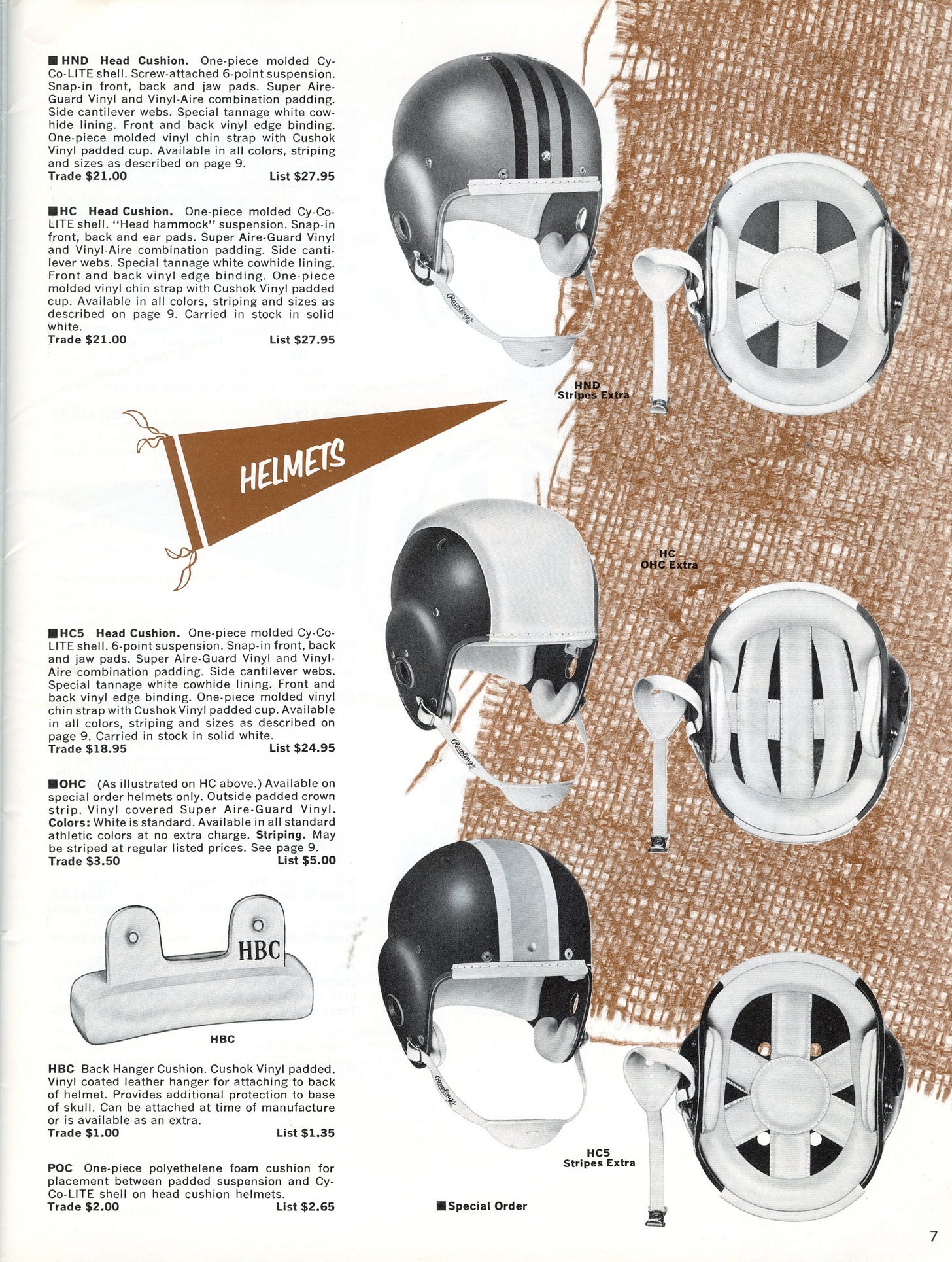
Like many that preceded it, the 1964 MacGregor catalog has page after page (42, to be precise) of black-and-white images of footballs, helmets, and pads shown on backgrounds with elements of brown burlap or other ornamentation.
We'll look at those pages and some of their elements in a few days, but the best part of this catalog is the 32-page center section showing football and basketball uniforms in living color.
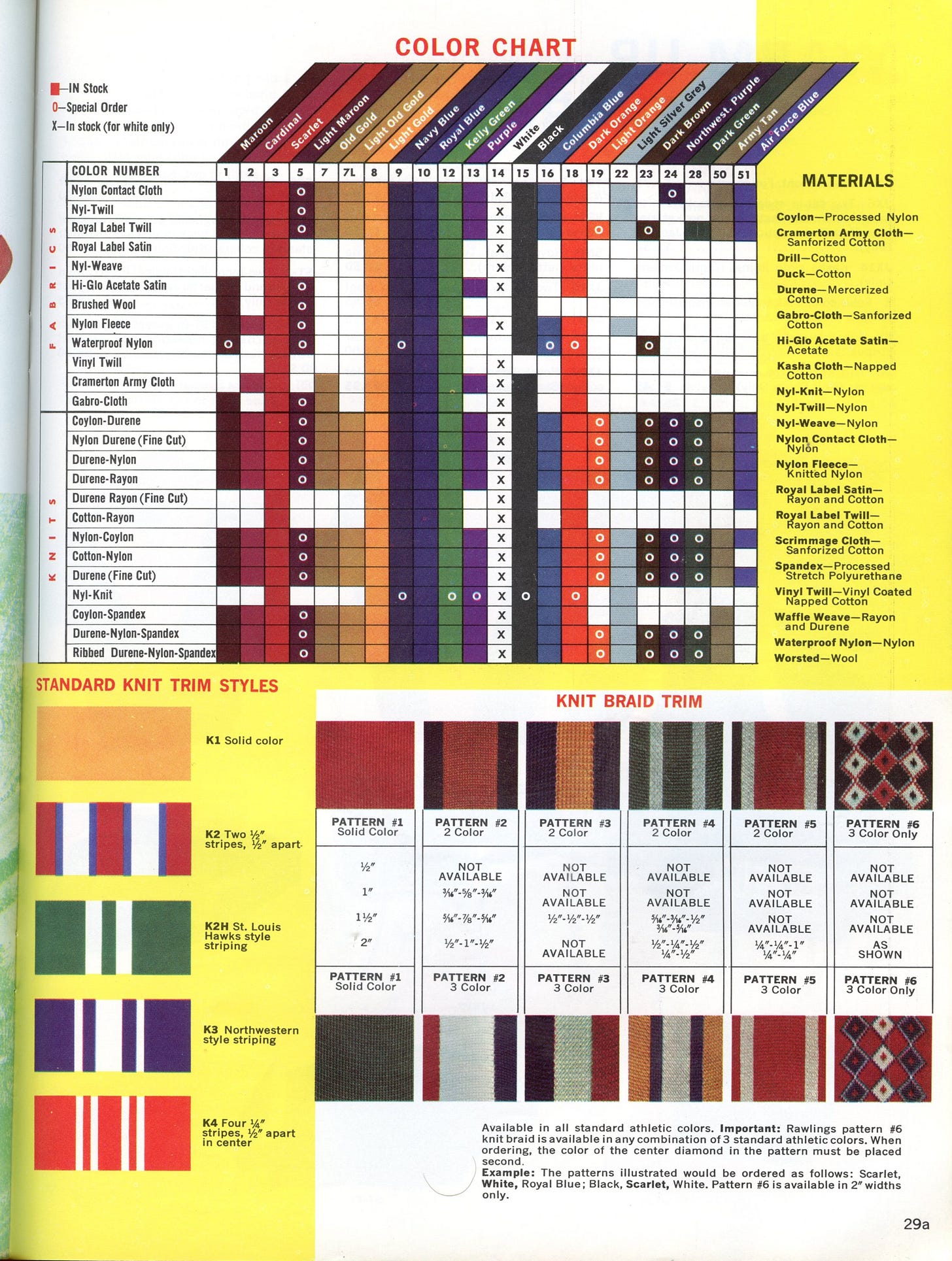
There is a limit to the number and size of the images I can include in a post, so I'll split the catalog's coverage across several days. We'll start by looking at their jersey offerings, but note that printed catalogs have limited space. Nowadays, we can look at items online, swapping colors to our heart's content to ensure we got it right. Back then, those ordering from the MacGregor catalog had to use their imagination, picturing how the primary jersey color combined with numbers and stripes in contrasting colors to achieve that championship look. Rawlings included the color chart below to expand and limit buyers' imaginations.
Other than Penn State, Notre Dame, and other boring teams, everyone in those days needed stripes on the shoulders, sleeves, or both, all available in seven fabric choices.
While some might accuse the Nittany Lions and Fighting Irish of jersey conservatism, others belonged in stripes for taking things to excess. One can only hope that no one ever sent their team onto the field wearing a Model TJM, pictured in the middle of the collection below. No color choices make that nasty design acceptable. Also, the variation in numbers, with plain block numbers, faceted block numbers, and the contoured "spotter numbers" pioneered at New Mexico in 1954.
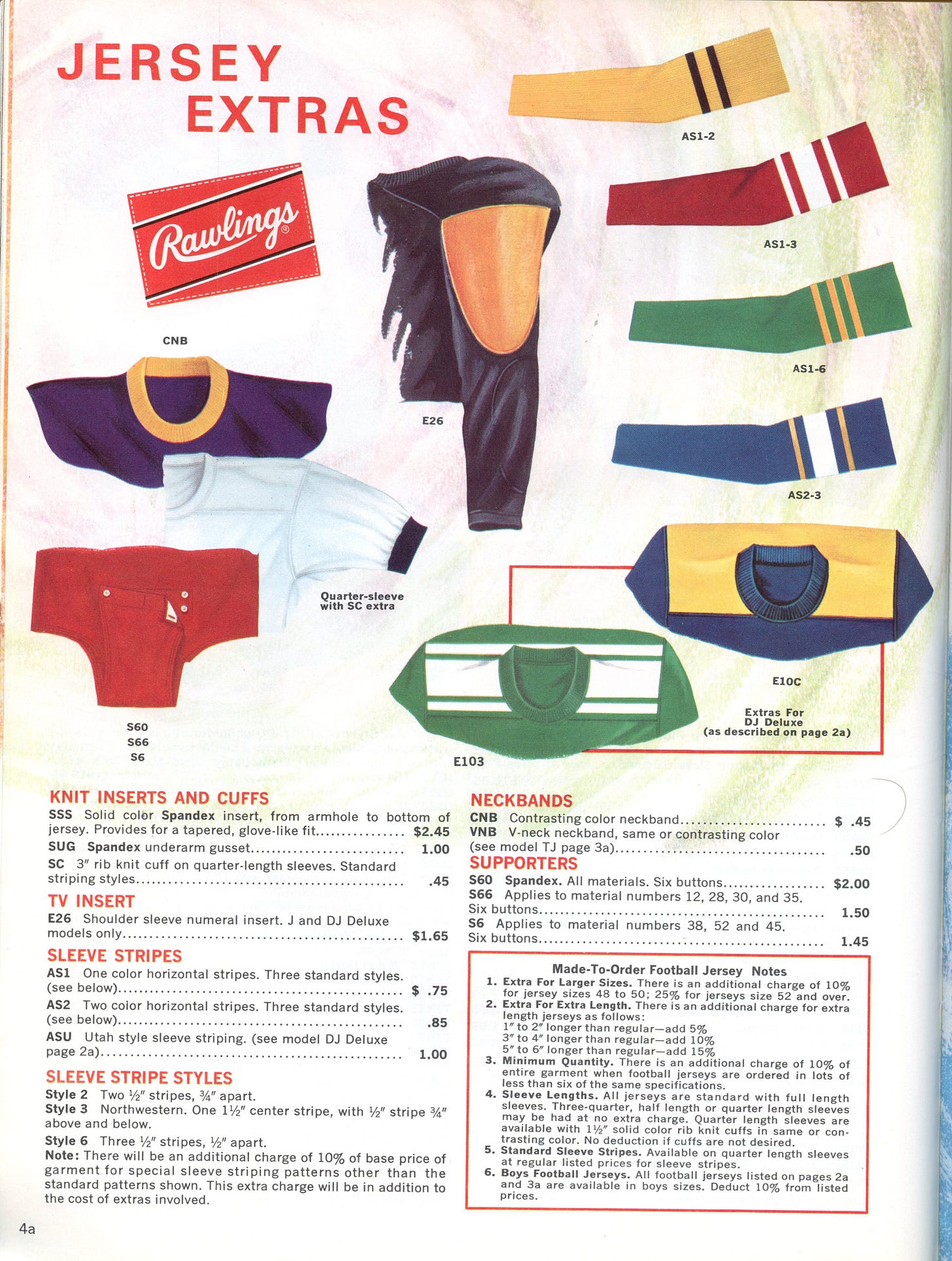
Rawlings offered numerous jersey options, including Spandex inserts for a glove-like fit, TV number sleeve inserts, striping, elbow pad pockets, and supporter straps for those who like their shirts tucked in.
Those who lacked the imagination or budget to design their jerseys could order off the rack and get a jersey perfectly acceptable to State College or South Bend residents.
That's it for MacGregor's jerseys. Come on back in a few days as we look at pants, helmets, pads, and sideline gear. We'll also step off the football field to look at the choices available to the boys on the hardcourt.
See you then.
Football Archaeology is reader-supported. Click here to buy one of my books or otherwise support the site.


This is really awesome. Also, I had no idea that jerseys with both shoulder loops and sleeve stripes were actually popular; I always assumed that the Eagles jerseys were just oddballs.
The color chart in these posts give a better representation of Columbia Blue and Air Force Blue: https://x.com/jamesleegilbert/status/1499891567670312968?s=20 Both UNC football and basketball switched to Air Force Blue in the late '60s. Football lightened up in the '80s, but men's basketball may have been using the same Air Force Blue in its uniforms until they were redesigned by Alexander Julian in 1991. Ironically Air Force Blue has been replaced by increased use of Navy Blue. (Julian was such a stickler for a more appropriate shade of Carolina Blue that he would eventually design new undergraduate commencement regalia because he didn't like the shade of light blue that was being used.)