
Today's Tidbit... Inconsistent Team Logos

I no longer pretend to understand branding in modern sports. It used to be that businesses issued brand guidelines documenting their brand colors, logos, and the proper use of the same, and they expected everyone to follow those rules. Teams and marketers understood that brand recognition came from using the same logo, slogan, or spokesperson appearing time after time after time. Consistently. Always.
Consistency was the key. It allowed people to turn on the television, spot the helmet logos and uniforms, and instantly know which teams were playing. That is no longer the case. Flexibility and adaptability are now thought to provide more value than consistency. While my old-school view takes issue with that idea, it provides the opportunity to point out situations from the past when consistent logo use was also optional, but not for the same reasons as today.
Inconsistent logos were a thing back in the day for two reasons, primarily because many logos were homemade or tailor-made. With logos designed one hundred or more years before PhotoShop, close enough was often good enough. So, here’s a handful of examples of more or less similar-looking serif and non-serif logos that would not meet today’s brand standards, the ones no one pays attention to anyway.
The boys at Oberlin did pretty well for the early 1890s, by the dude on the floor in the middle is logo-challenged.

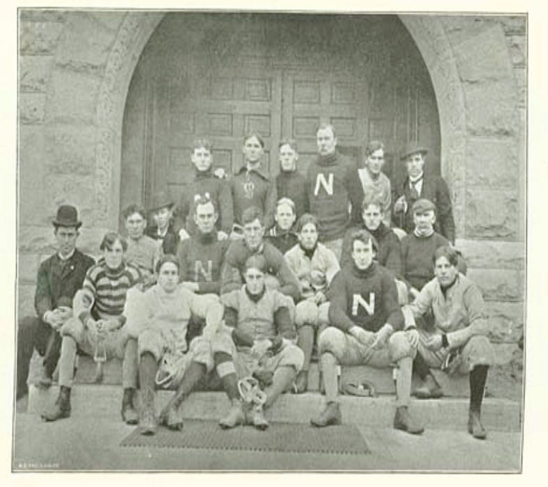
Other than schools like Penn State or Notre Dame, Nebraska has the plainest logo in the land. Perhaps the failure of the turn-of-the-century boys to use consistent colors and sizes sent them down that corn row.
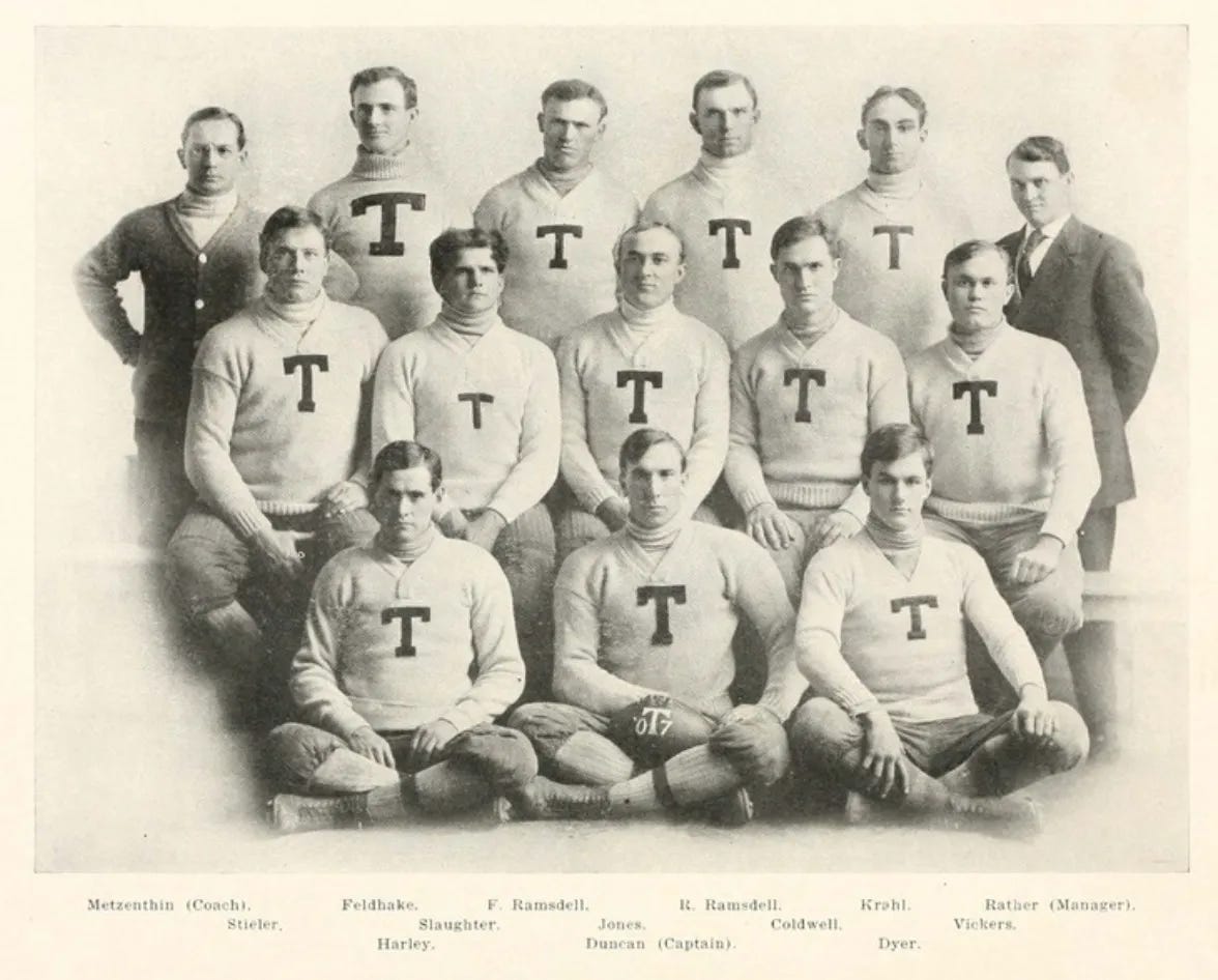
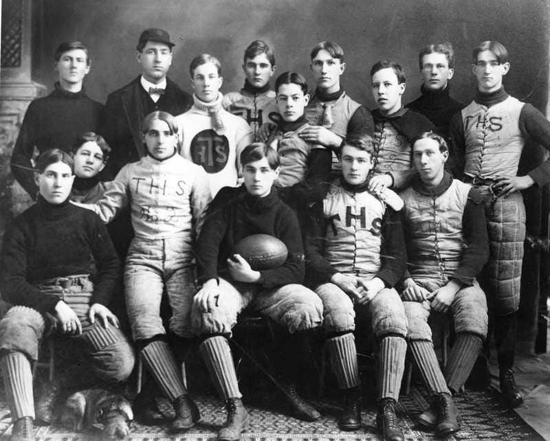
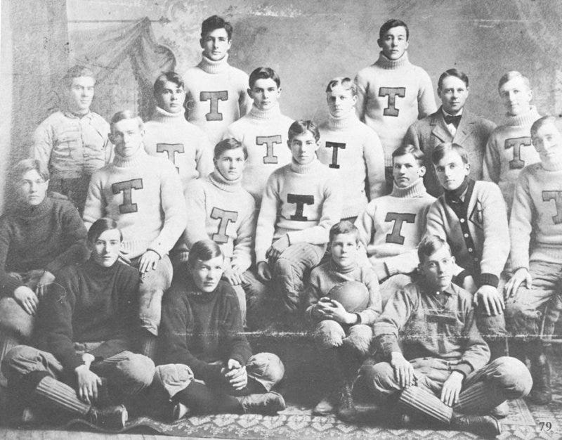
Things were so tough at Tufts back in the day that they couldn’t figure out their Ts' color, height, or width.
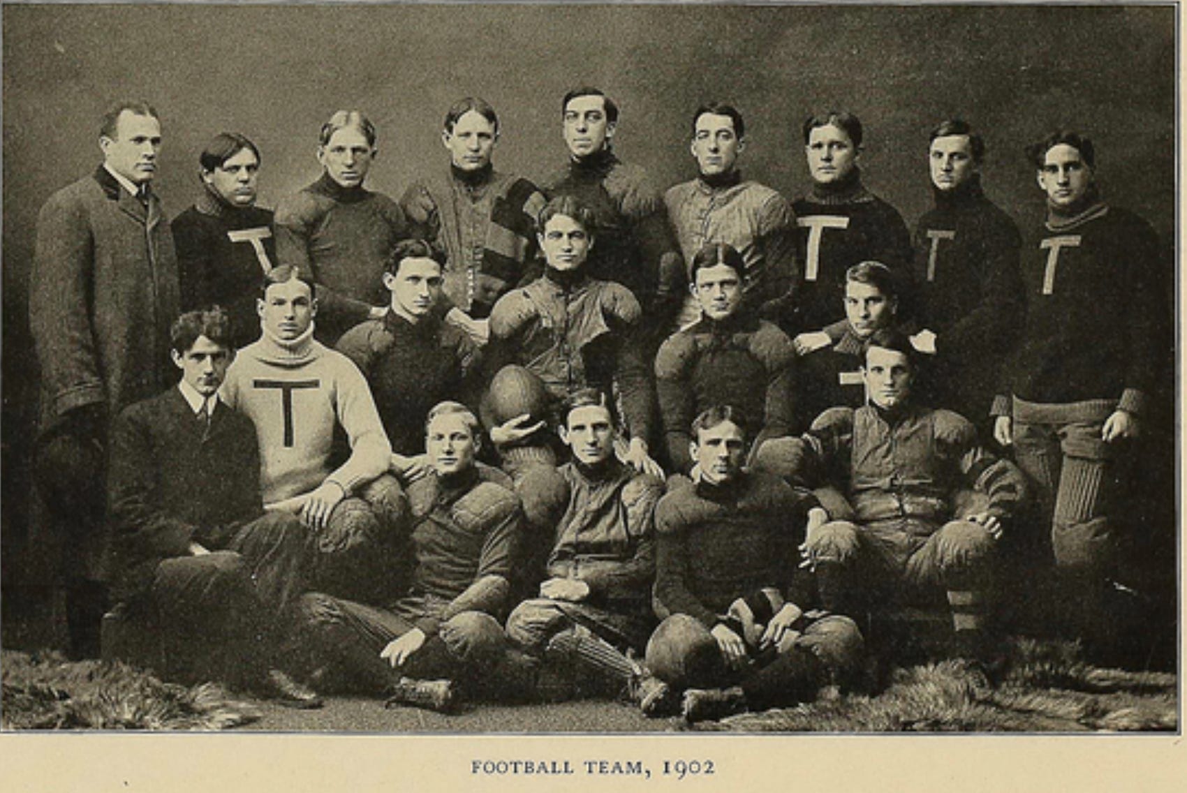
T, t, t, Texas had similar problems. Thick, thin, tiny, and tall, to say nothing of serifs and non-serif fonts.
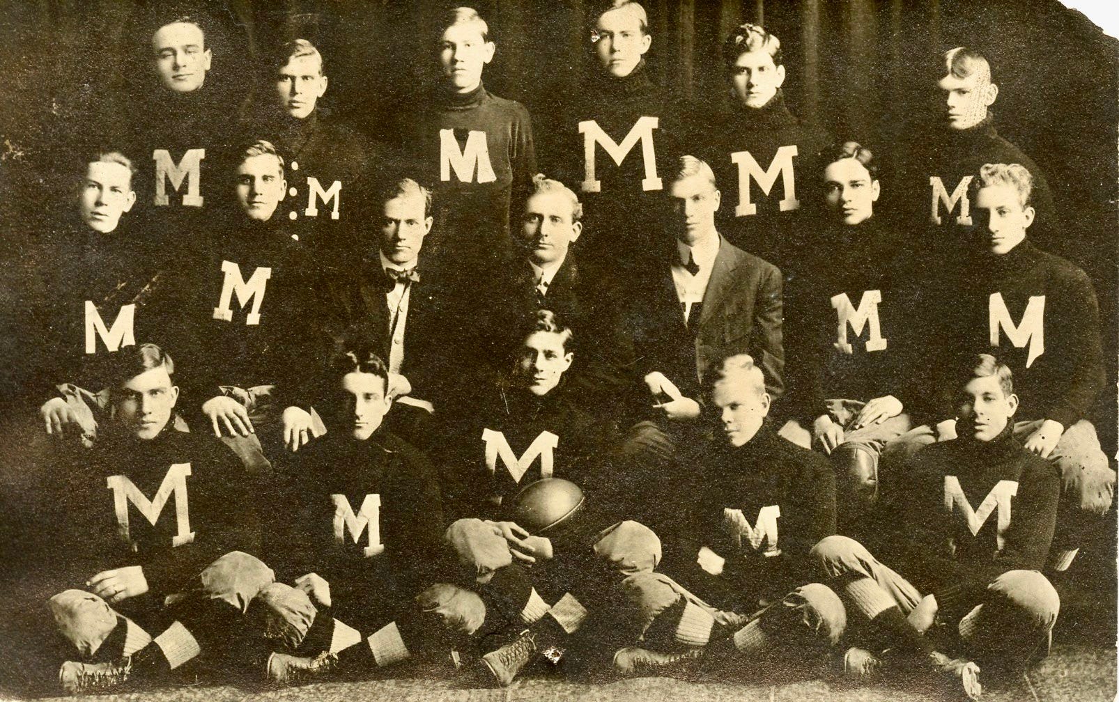
And then there were high schools, like mighty Moline, Illinois. All the players had an M adorning their jerseys, but you could probably create a starting eleven, each of whom bore a unique M.
Let me know if you spot other logo inconsistencies in the historic wild.
Postscript: Here’s more submitted by readers
Football Archaeology is reader-supported. Click here to buy one of my books or otherwise support the site.
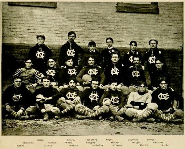
Here's one from the University of North Carolina's archives; they're mostly consistent, but note the one player at the center of the bottom row. The reverse indicates it's their 1896 team
https://dc.lib.unc.edu/cdm/singleitem/collection/dig_nccpa/id/36830/rec/442
Agree wholeheartedly on your old school branding take. So many teams wear whatever colors are cool that week and have a million different logos. There’s a lot to be said for coming out in the same thing week in and week out. Clemson has a pretty interesting case of color identity crisis, between purple/navy as their secondary color. A few different stories out there on what really happened but the back and forth is interesting.