
Today's Tidbit... Football's Interlocking Monograms

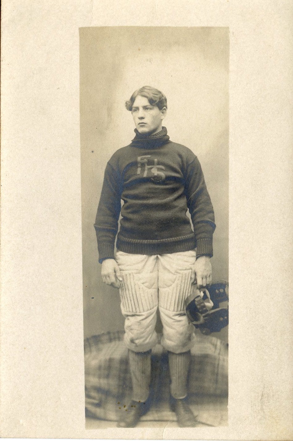
Uniforms were less uniform in the past. Teams at lower levels and with less money often did well if everyone wore something bluish, reddish, or whatever the team’s color might be. Uniformity was neither the expectation nor the reality for many teams until the 1920s.
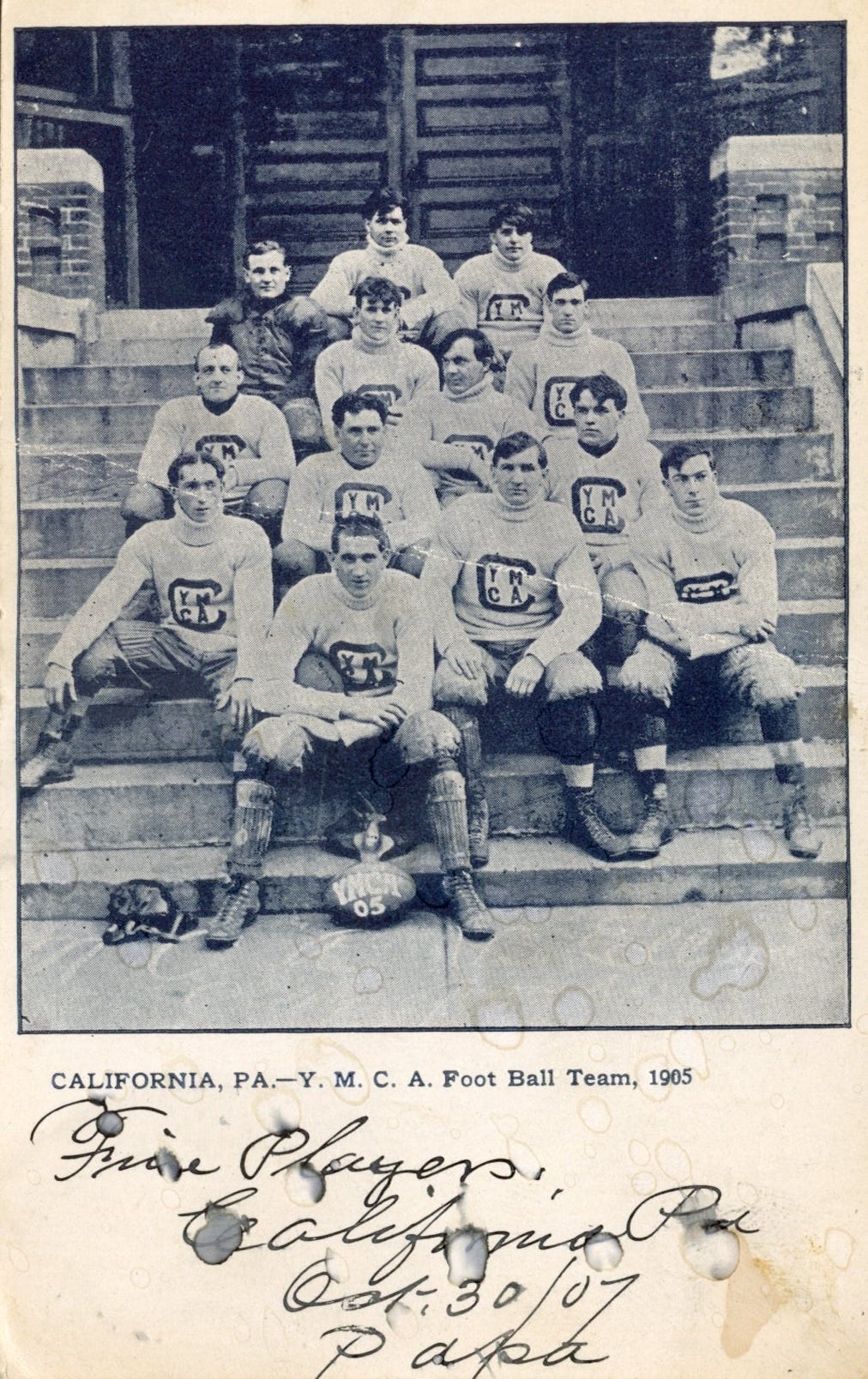
Of course, teams whose pockets overflowed with silver wore the latest matching gear, or nearly so. The big buck teams also wore distinctive logos on their uniforms or award sweaters, with some choosing monograms, even interlocking monograms.
American sports have had interlocking monograms since at least 1877, when Tiffany and Co. designed the New York Yankees’ logo. Interlocking monograms were particularly popular with baseball teams, and while football teams leaned toward single-letter logos, interlocked logos also graced the gridiron.
Teams had their logos designed and embroidered by the local seamstress or the good folks at Spalding's handled the job. All you had to do was choose your lettering style, the two-, three-, or four-letters in the monogram, and provide them with a sketch of the desired layout. They handled the rest.

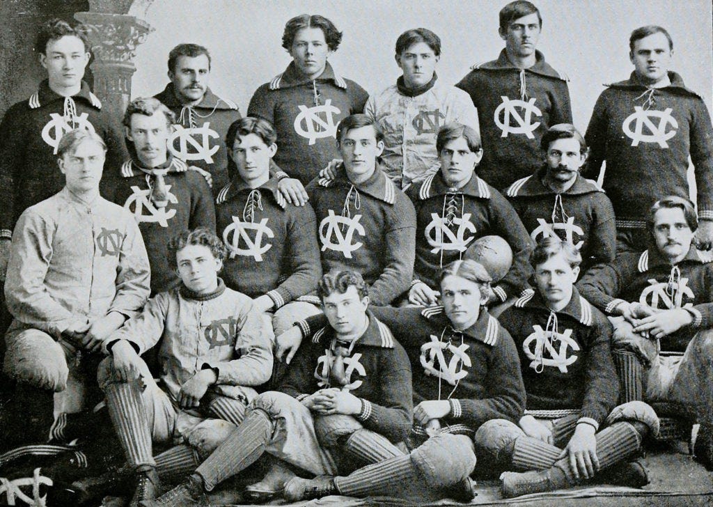
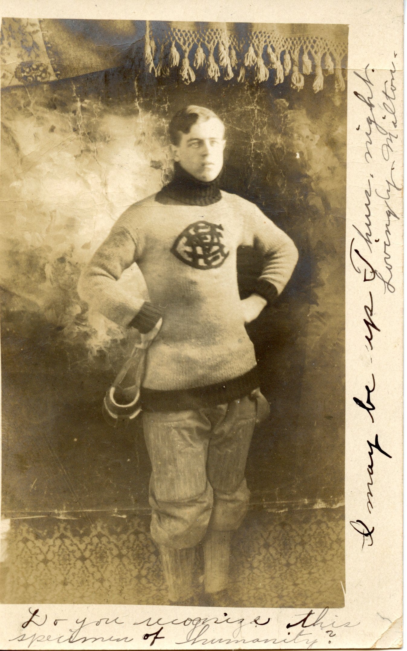
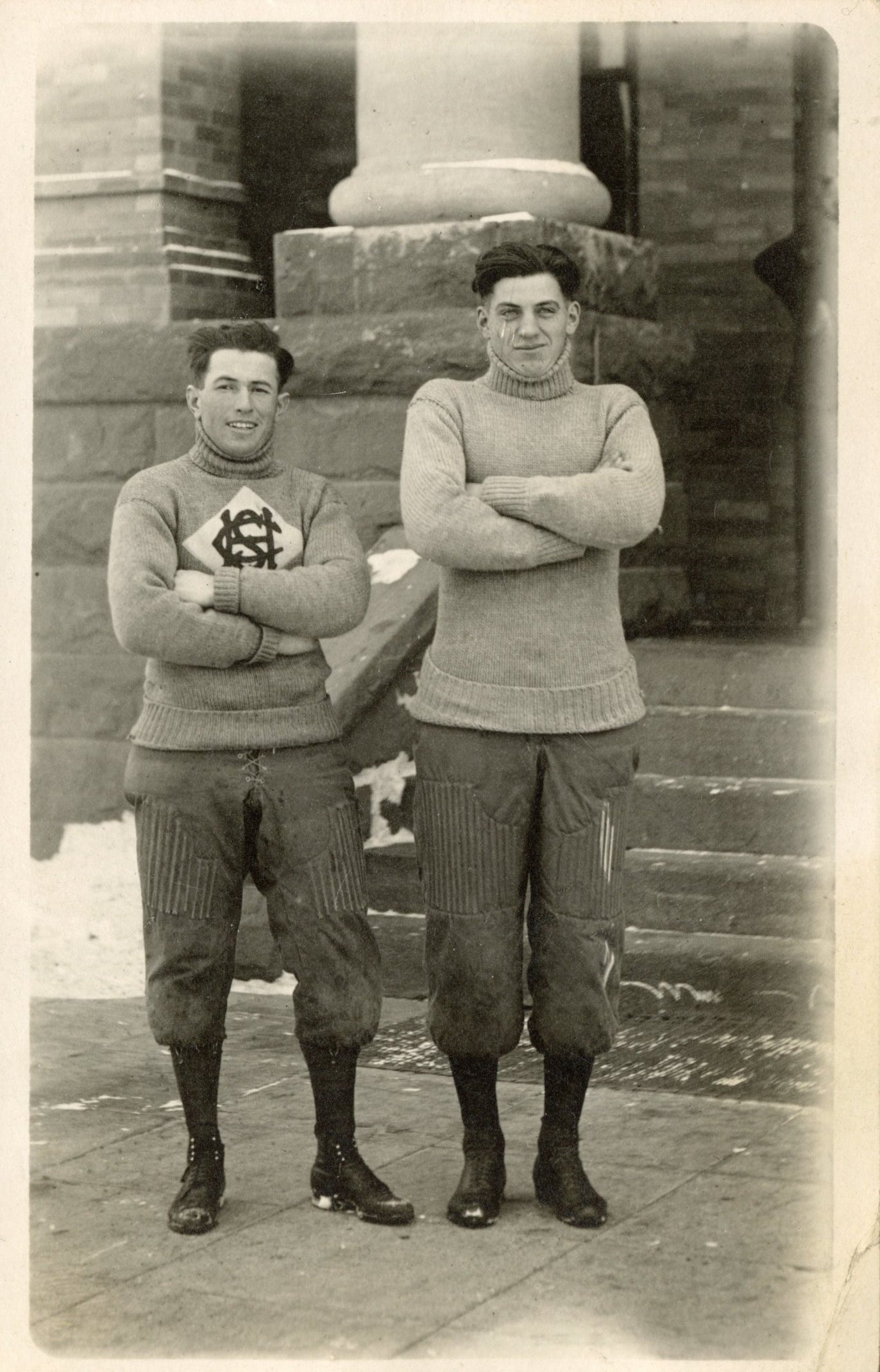
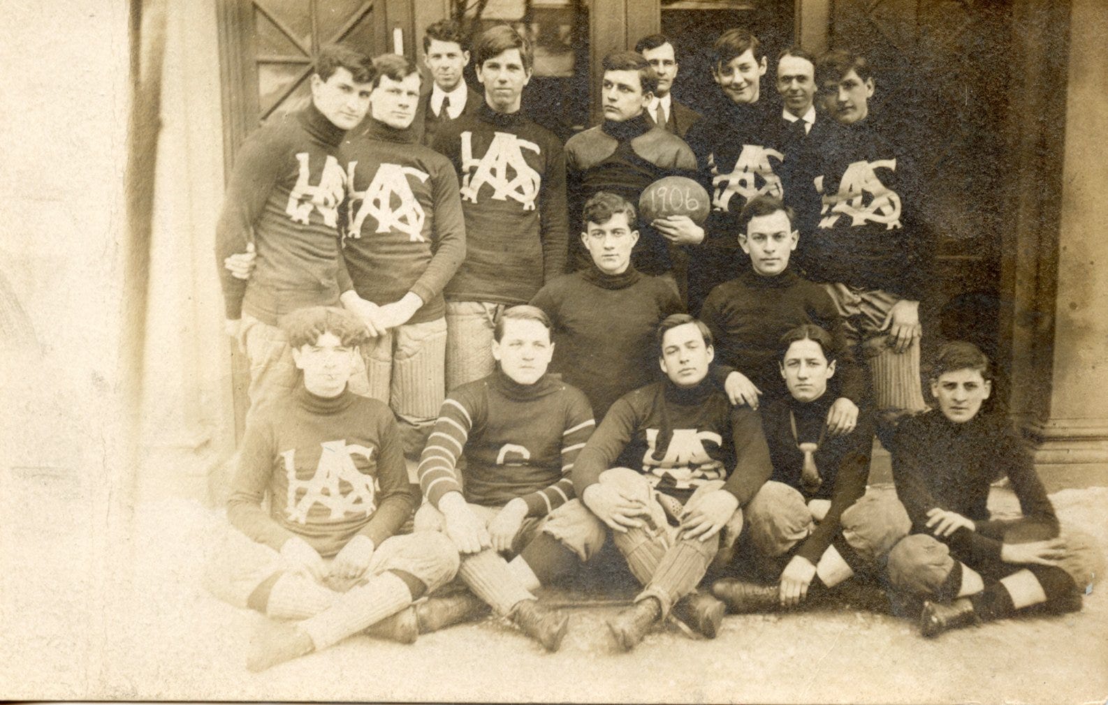
Examples of interlocking and non-interlocking monograms from 1910 and earlier include the following:
Interlocking monograms remain common on baseball caps today and are the primary logo for ten Power 4 teams. Everyone except UNC uses a block typeface rather than the script, fancy, or Olde English styles popular in days gone by.
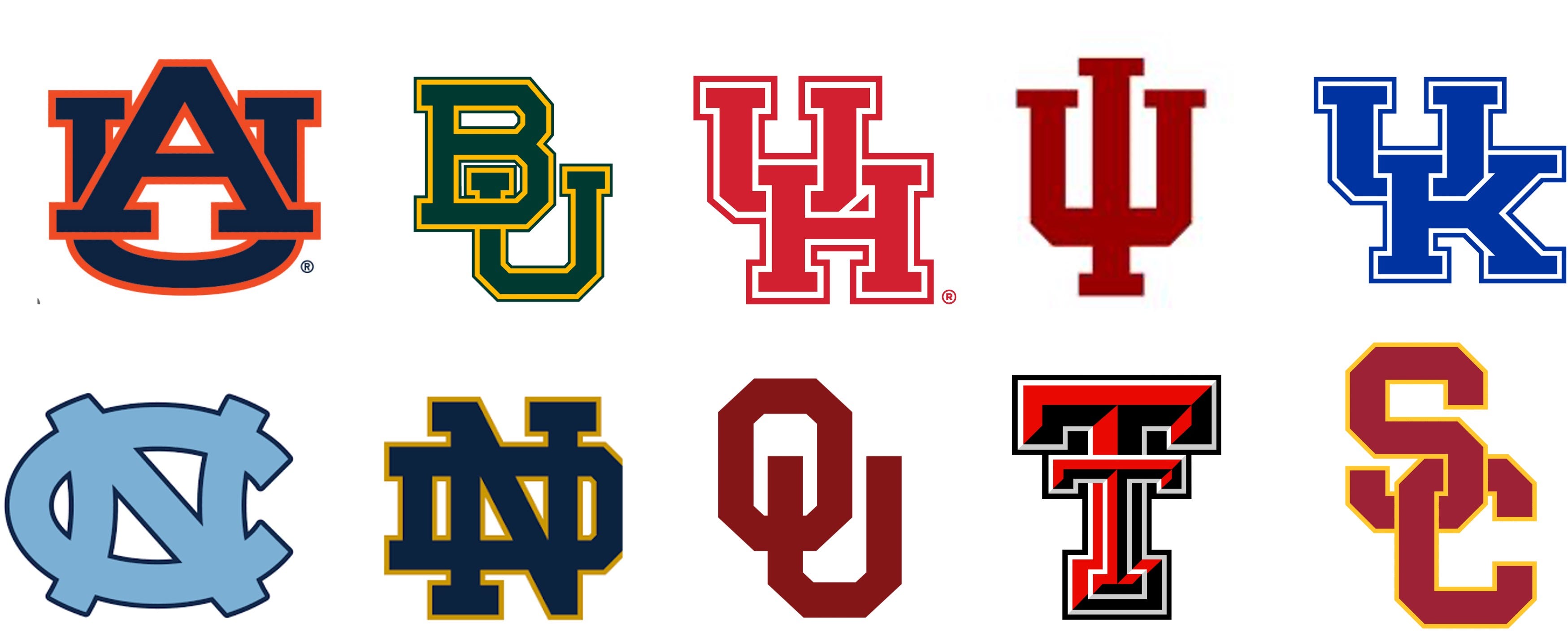
Finally, I’m not going to spend the time to check whether Houston plagiarized Kentucky’s monogram or the other way around. I just know the Spalding brothers wouldn’t have let that happen.
Click here for options on how to support this site beyond a free subscription.
The curved legs of the NC monogram really differentiate it from similar NC logos of the time that had straight legs. I've been unable to determine if that was a design sent to Spalding or if Spalding came up with it. I wrote about how to draw your own NC interlocking logo here: https://jamesleegilbert.substack.com/p/how-to-draw-uncs-iconic-interlocking
The Auburn logo was designed by an Auburn marching band member(!) in the '60s.
Your readers may enjoy sportslogos.net and its history of team logos, not just college either.
Naturally, ND's came to mind first, but I didn't realize the inspired North Carolina monogram was that old. The invented fonts from those days for some teams are a trip; good to know whom to thank for the Yanks' ..