Today's Tidbit... Pre-1940 Advertising Premium Football Art
I've mentioned many times and shown excerpts from football-themed advertising premiums given out at point-of-sale from the mid-1890s (or earlier) until today. The most common premium has been the pocket schedule. About the size of a credit card, they come in two sides or four and fit in any pocket or wallet. They were convenient items before internet access and continue in use today, so somebody uses them.
I especially like the composite schedules for national and sometimes regional audiences. They typically devote the bulk of their pages to the schedules of several hundred schools, but I enjoy them because they are time capsules of football that year. Besides the team schedules, they often summarize the previous year's results, top player profiles, plays, coaches, and stadiums. They have diagrams of the official's signals and explanations of the season's rule changes. They sometimes show recent All-Americans or all-time best teams.
A side benefit of them being advertising premiums is that they contain advertising. Many tout long-forgotten brands and products using language and imagery that would not cut the mustard today.
And then there are the premium covers. Many had run-of-the-mill artwork. They are cheap and unimaginative, but perhaps they caught the eye of those who appreciated that style. My eye goes to the covers that stand out as different for the times or seem to capture the essence of commercial art during the period.
Today, we'll look at a selection of pre-1940s covers that are cool in one way or another, and we'll show covers from 1940 and beyond tomorrow.
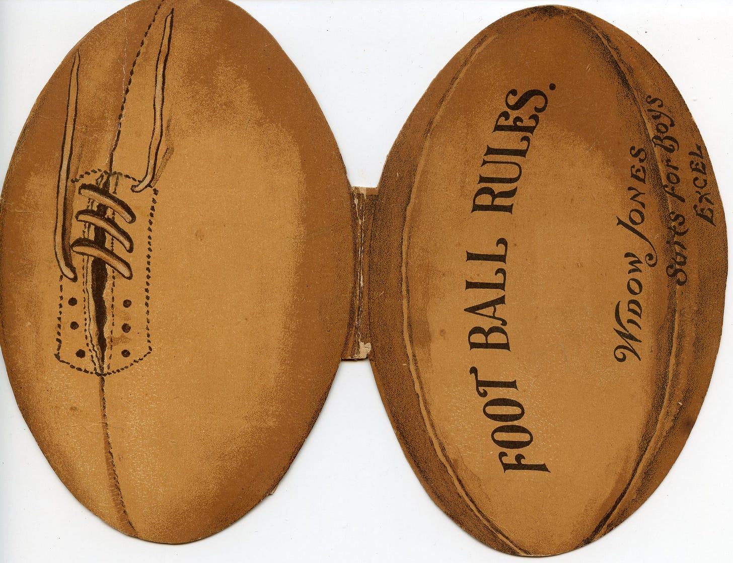
Widow Jones manufactured suits for boys, and what well-dressed boy did not want to carry a copy of the 1896 football rules in his pocket?
The Chicago Daily News Football Visualizer was the subject of an article two weeks ago but is worth showing again.
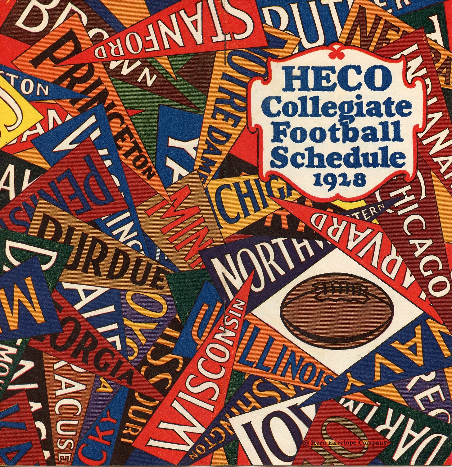
The 1928 HECO Collegiate Football Schedule also had a place in an earlier story about a co-owner who played for Great Lakes in the 1919 Rose Bowl.
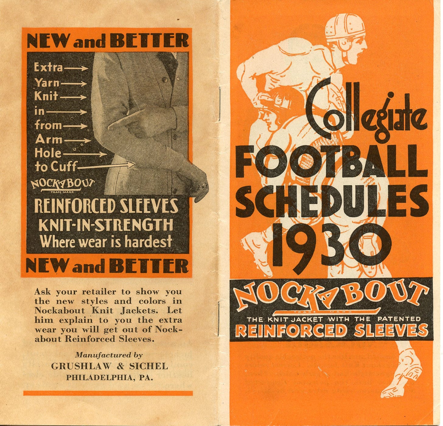
I have several premiums put out by clothing manufacturers, particularly those making jackets or outdoor gear you might wear to a game.
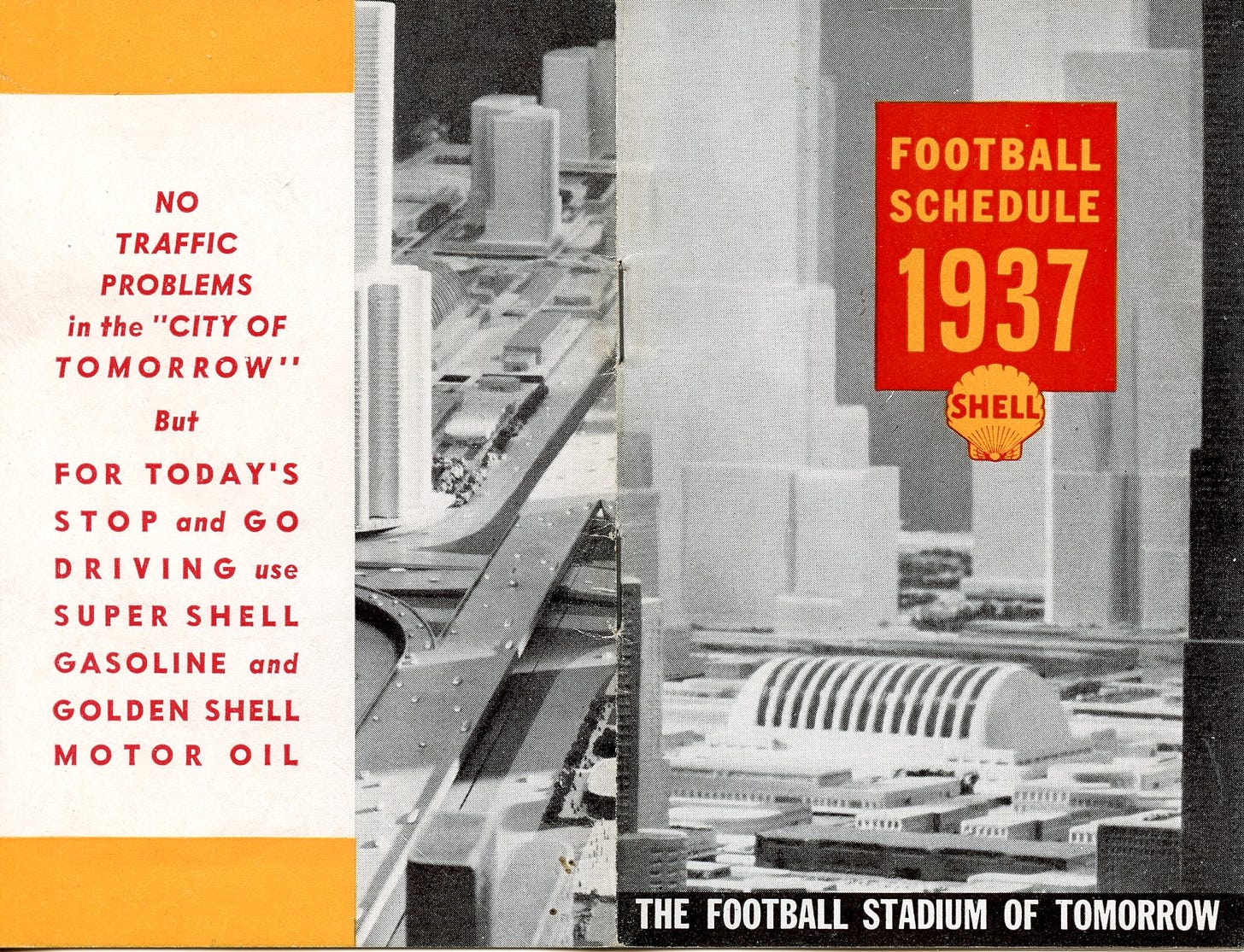
Shell had many schedule premiums in the 1930s. The first one below is interesting for the overall design and cut. Several images from the second premium were featured in an article about football stadiums of the future as conceived by architects and futurists of the past.
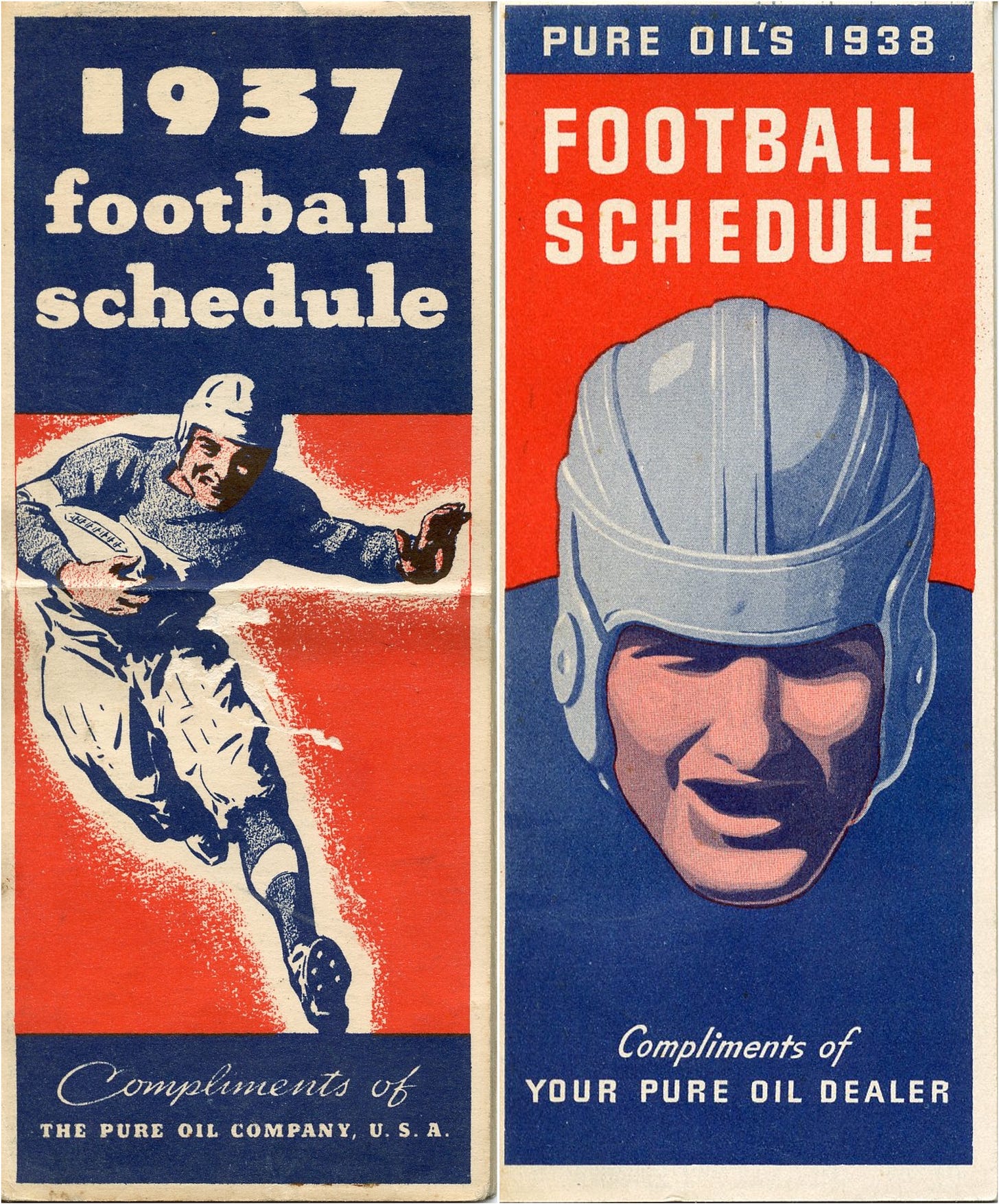
The next two are among my favorite cover designs, especially the 1938 version. Both are great examples of period cover art using two-color printing. If I come across examples from other years, I’m buying them.
Last for now is the 1938 Saturday Evening Post cover. The player being tackled in the big stadium is fun, as is the opposite page slogan reminding all that the Saturday Evening Post was a bargain since it was “Still the biggest nickel’s worth it the world.”
If you enjoyed this look at commercial football art, come back tomorrow or check out previous articles covering:
Football Archaeology is reader-supported. Click here to buy one of my books or otherwise support the site.


